
Appearance
A Filament theme editor for public websites
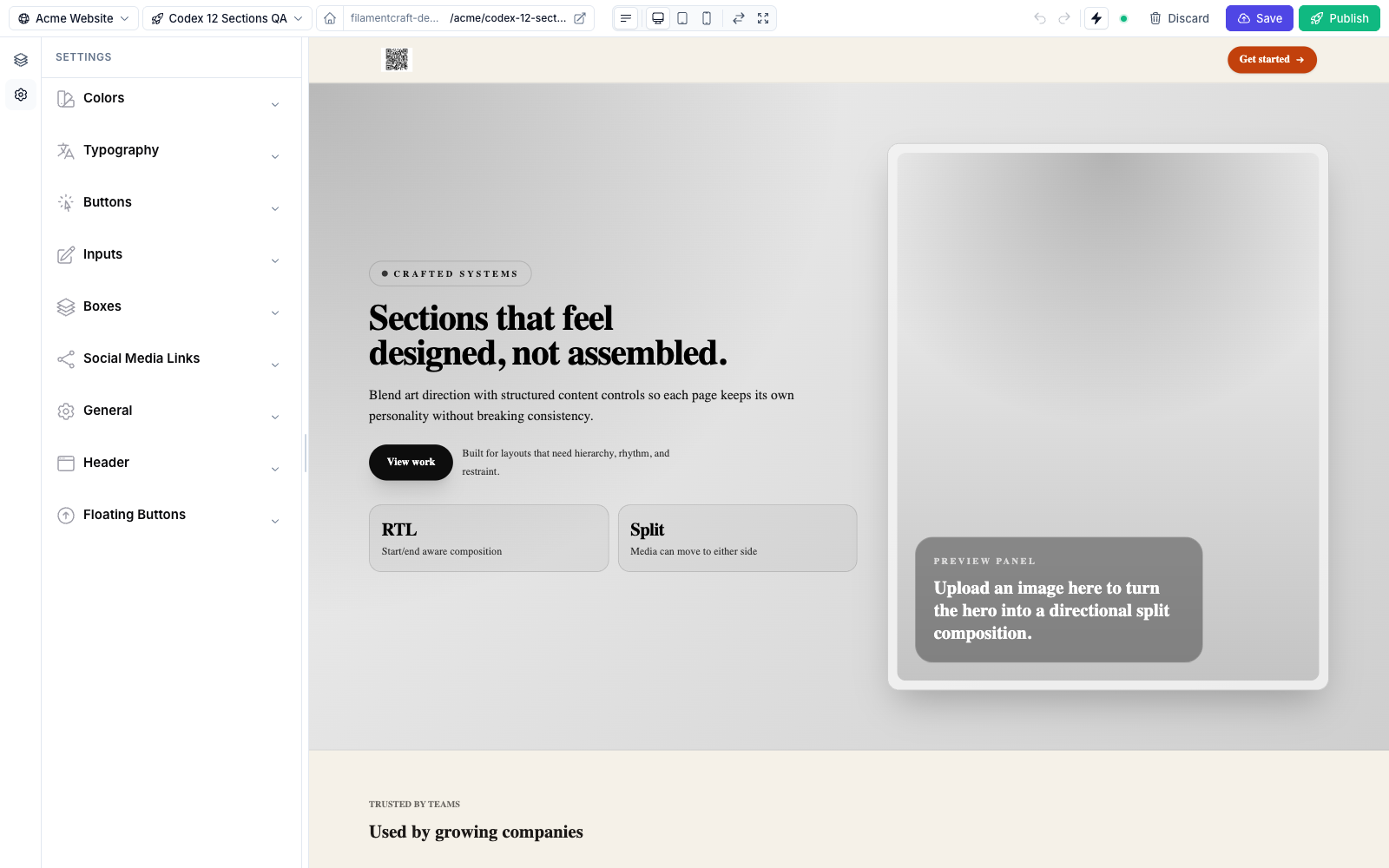
If you need a Filament theme editor for public websites, one where a non-developer changes colors and fonts and the whole site follows, FilamentCraft ships one inside the page editor. Colors come from semantic color schemes, fonts come from a searchable picker that also accepts uploaded files, and every value lands as a CSS custom property that your sections read.
This post covers the editor side first (schemes, fonts, custom fonts, the visitor dark mode toggle), then the developer side: how a theme class declares that panel and how your own CSS consumes it.
How the Filament theme editor for public websites is built
The theme editor is a settings panel whose every control maps to a CSS variable on the rendered page. A theme class returns Category groups of setting types, and each setting that calls cssVar() is emitted into a <style id="fc-tokens"> block on :root of both the editor preview and the public page.
That design choice explains most of what follows. Sections never hardcode a hex value or a font family. They read var(--fc-color-primary) or var(--font-heading), so changing a value in the panel changes one variable, and everything that reads it repaints. The package ships one default theme, StudioTheme, with a nine-category panel. You can keep it, add your own next to it, or replace it.
Color schemes as semantic tokens
A color scheme is a set of 22 semantic tokens: Background, Surface, Surface Alt, Primary, Secondary, Accent, Neutral, Info, Success, Warning and Danger, each paired with an on-* foreground token. Editors pick a scheme from a grid of tiles, or click a tile to edit its tokens one by one.
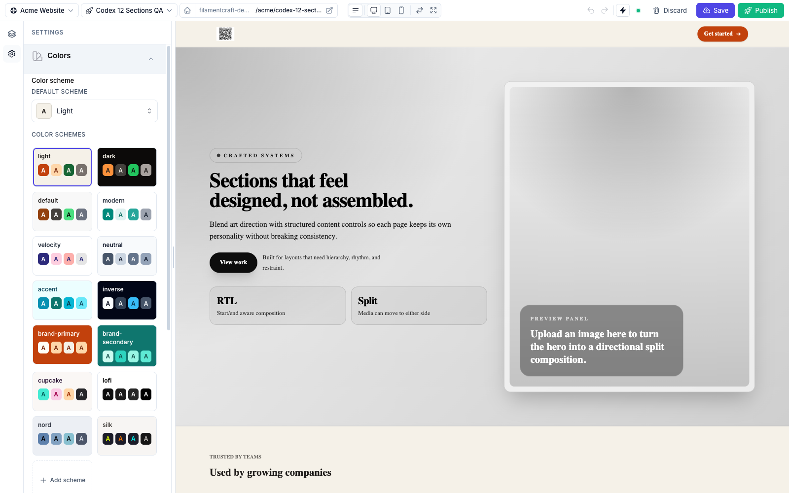
There are 14 built-in schemes (light, dark, modern, nord, silk and others), and the package default is modern. Built-ins are editable per site. An edit is stored as a site-level override, and an override identical to the package default is dropped, so a built-in nobody touched keeps inheriting token changes from later package versions. Editors can also add their own schemes, cloned from any existing one.
For every non-on-* token, the ColorSchemeGroup setting also emits an 11-step shade ramp computed in OkLch, --color-primary-50 through --color-primary-950, scoped under each scheme's selector. Once you map those in Tailwind, hover:bg-primary-700 works and re-resolves when the scheme changes.
The active scheme is site-wide. It lives on Site.settings_json['color_scheme'], and every template, region and host-rendered shell page reads it. That was not always true. Before 1.31.0, the scheme picker sat among the global settings but persisted onto whichever page was open, so picking a scheme restyled one template and nothing else. The fix moved it to the site row and shipped a migration that promotes the scheme a live site had already chosen. Per-page variation now lives where it belongs, in each section's own scheme setting.
The effective scheme map is three layers merged in order, later winning: the package defaults, the theme's tokens_json['schemes'], then the site's own overrides. You can drive all of it from code with SiteColorSchemes:
php
use FilamentCraft\Support\SiteColorSchemes;

$schemes = SiteColorSchemes::forSite($site);
$active  = SiteColorSchemes::activeFor($site);

$slug = SiteColorSchemes::add($site, cloneFrom: 'dark', slug: 'noir');
SiteColorSchemes::setActive($site, 'noir');
Typography and the font picker
Typography settings are Font setting types, and each one renders as a picker with category chips and search. A theme typically declares a body font and a heading font, each bound to a CSS variable (--font-default and --font-heading in the default theme).
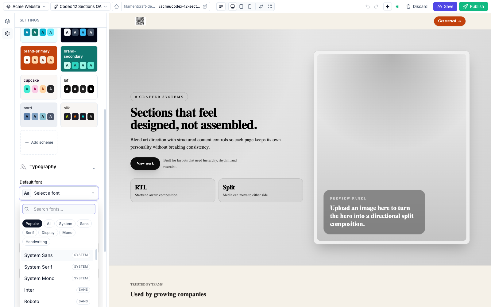
Sections can override the theme fonts too. Every section gets a collapsed Typography panel with Heading font and Body font fields. Left on the theme default, the section inherits. Pick a font and the section wrapper gets inline --font-heading and --font-default variables, the same names the theme sets on :root, so the override cascades through that section with no extra stylesheet. If you don't want editors doing this, set sections.typography_overrides to false in config/filamentcraft.php.
Custom fonts from inside the editor
Client fonts are often not on any CDN, and adding one should not need a deploy. Every font picker has an Add custom font button in its footer. The editor gives the font a name, picks a category (which decides the fallback stack), and adds one row per weight and style, either uploading a .woff2, .woff, .ttf or .otf file or pasting a URL to one.
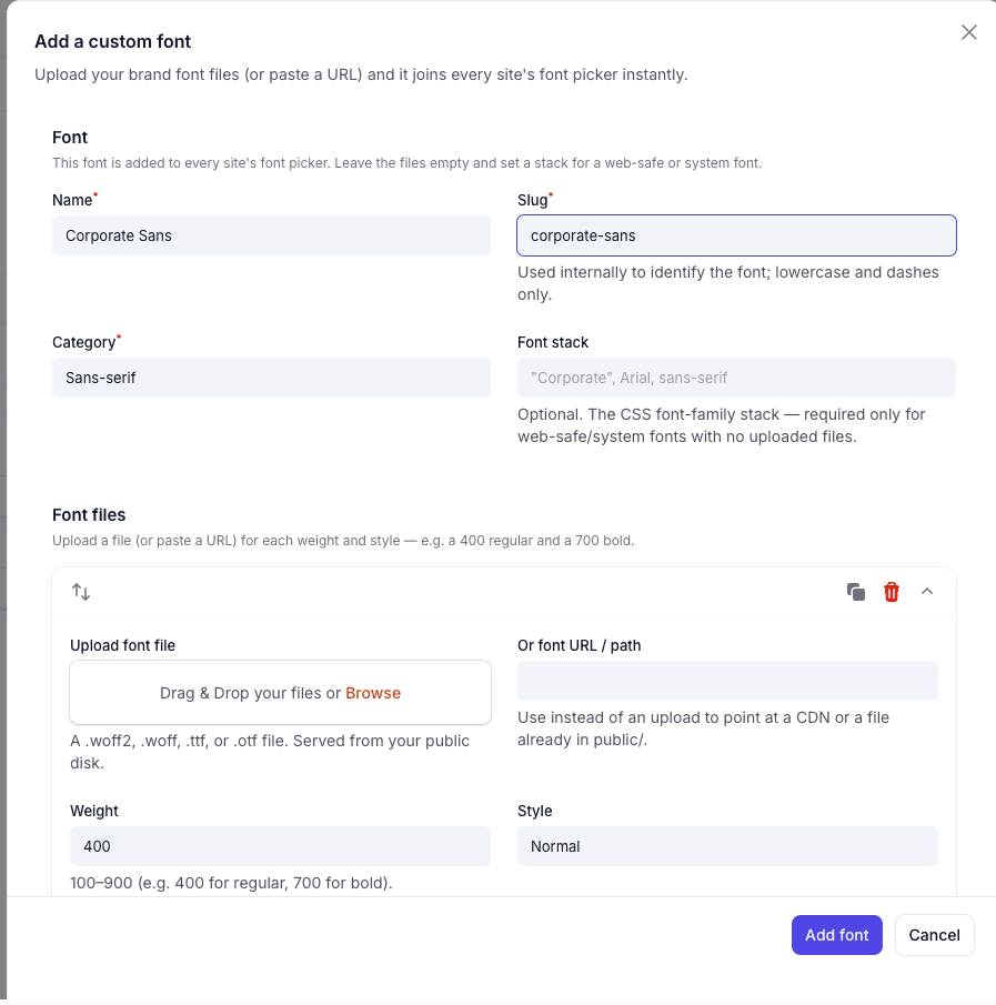
The saved font is selected in the picker it was added from and shows up in every other picker, with its @font-face emitted on the public page and in the preview. Uploads are checked against font MIME types and against the file's magic bytes, so a script renamed to .woff2 is rejected. Font names and src URLs are validated before they are written into the <style> block.
If you would rather version fonts with the app, register them on the plugin instead. The same mechanism also locks pickers down for agency work:
php
use FilamentCraft\Enums\FontCategory;
use FilamentCraft\FilamentCraftPlugin;
use FilamentCraft\Support\BrandFont;

FilamentCraftPlugin::make()
    ->registerFont(
        BrandFont::make('rvo-display', 'RVO Display')
            ->category(FontCategory::Display)
            ->face(asset('fonts/rvo-display.woff2'), '400')
            ->face(asset('fonts/rvo-display-bold.woff2'), '700'),
    )
    ->brandFonts(['rvo-display', 'system-sans'])
    ->withoutBuiltinSchemes();
brandFonts() restricts every font picker to those slugs, and withoutBuiltinSchemes() hides the 14 built-in schemes from the picker. Both are authoring-time only: a page already using a hidden scheme or font keeps rendering. The Brand Kit guide covers the palette lock and the rest of that setup.
A dark mode toggle for visitors
The built-in Header and Footer sections have an opt-in sun and moon button for site visitors. Editors turn on show_scheme_toggle in the section's Dark mode settings group and choose inline or floating placement.
Clicking it sets data-fc-scheme-override="dark" on <html> and stores the choice in localStorage under a per-site key. The override CSS is pre-rendered for every scheme, so the switch needs no server round trip. An inline script in <head> re-applies the stored choice before first paint, which avoids a flash of the light theme for returning visitors. In 1.29.0 that restore also started running on livewire:navigated, because it had only run once and the first wire:navigate link dropped visitors back to light.
The button targets the dark scheme by default, but any scheme slug works. Custom sections can include the same partial:
blade
@include('filamentcraft::sections.partials.scheme-toggle', [
    'floating' => true,
    'darkScheme' => 'nord',
])
Writing your own theme class
A theme is one class that extends AbstractTheme. Scaffold it with php artisan make:filamentcraft-theme Acme, then fill in settingsSchema():
php
use FilamentCraft\Settings\Types\Category;
use FilamentCraft\Settings\Types\ColorSchemeGroup;
use FilamentCraft\Settings\Types\Font;
use FilamentCraft\Settings\Types\Range;
use FilamentCraft\Theming\AbstractTheme;

final class AcmeTheme extends AbstractTheme
{
    public function slug(): string
    {
        return 'acme';
    }

    public function name(): string
    {
        return 'Acme';
    }

    public function settingsSchema(): array
    {
        return [
            Category::make('colors')
                ->label('Colors')
                ->icon('heroicon-o-swatch')
                ->settings([
                    ColorSchemeGroup::make('color_scheme')->default('light'),
                ]),

            Category::make('buttons')
                ->label('Buttons')
                ->icon('heroicon-o-cursor-arrow-rays')
                ->settings([
                    Font::make('heading_font')->cssVar('--font-heading')->default('playfair-display'),
                    Range::make('button_radius')
                        ->cssVar('--button-radius', 'px')
                        ->unit('px')->min(0)->max(24)->default(8),
                ]),
        ];
    }
}
Register it under themes.register in config/filamentcraft.php (this works for panel routes and public routes) and run php artisan filamentcraft:sync-themes to create the matching Theme row. Then read the variables in your CSS:
css
.btn {
  border-radius: var(--button-radius);
  font-family: var(--font-heading);
}
Color tokens are emitted under two names, --fc-color-primary and --color-primary. Built-in sections use the first. The second exists so a Tailwind v4 @theme inline block can map it into utilities like bg-primary. If a design needs rules no setting can express, a theme's stylesheets() method returns URLs injected into the <head> of every public page and the editor preview.
The theme authoring guide walks through registration and variable mapping in full, and color schemes documents the token map. To try the panel before installing anything, open the live demo.