
Appearance
Color Schemes
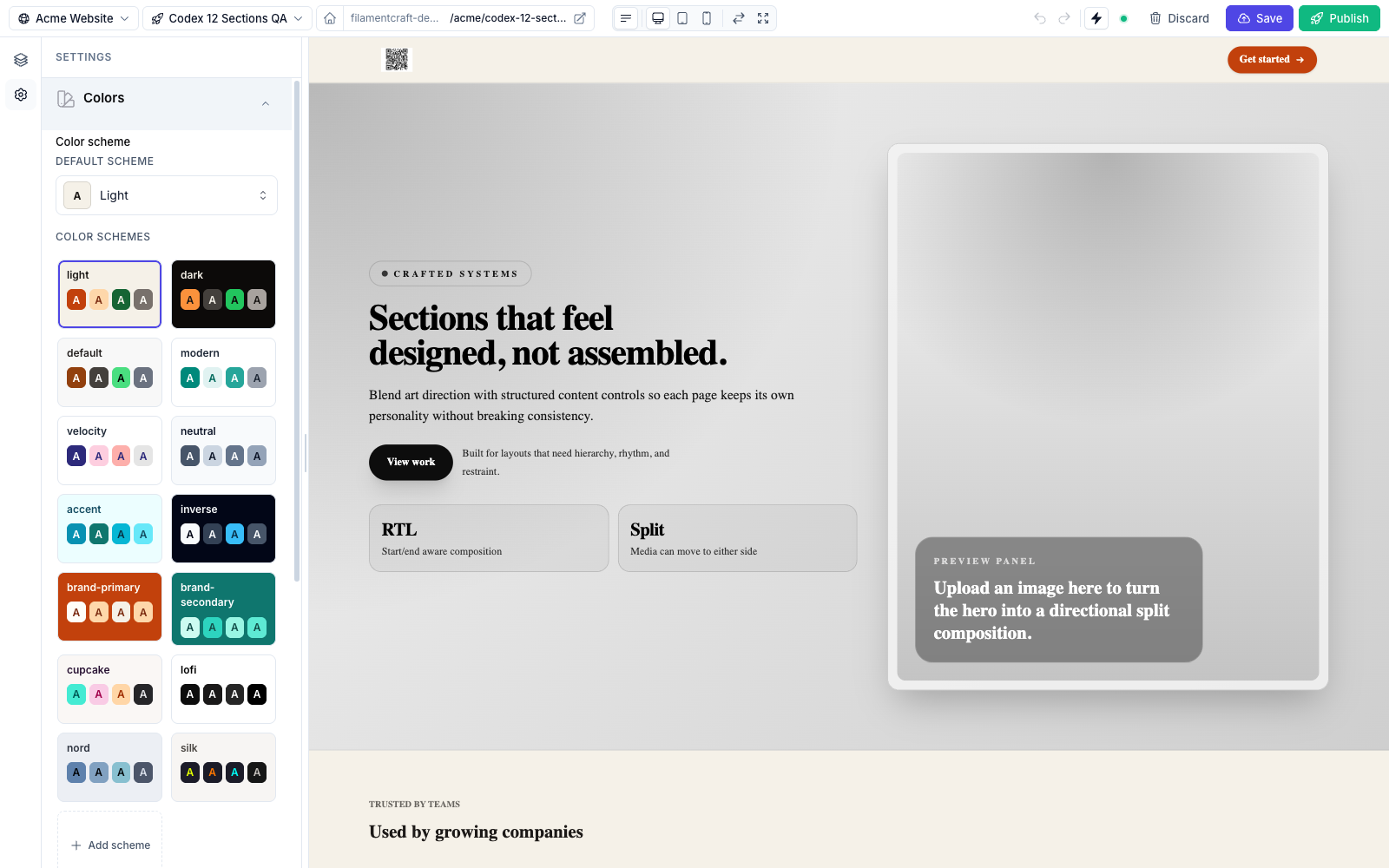
A color scheme is a coordinated set of 22 semantic color tokens (Background, Surface, Primary, and their on-* foreground pairs, etc.). Sections reference these tokens semantically — bg-primary, text-on-surface — so changing the scheme re-skins the whole page without touching any section.
The system is driven by the ColorSchemeGroup theme setting and the ColorScheme per-section picker.
The token editor
ColorSchemeGroup::make('color_scheme') renders a grid of scheme tiles plus an "Add scheme" affordance. Click a tile to drill into the 22-token editor.
22semantic tokens
14built-in schemes
OkLchauto shade scale
The 22 tokens are paired foreground/background semantics:
| Background token | Foreground token |
|---|---|
| Background | On Background |
| Surface | On Surface |
| Surface Alt | On Surface Alt |
| Primary | On Primary |
| Secondary | On Secondary |
| Accent | On Accent |
| Neutral | On Neutral |
| Info | On Info |
| Success | On Success |
| Warning | On Warning |
| Danger | On Danger |
The 14 built-in schemes
These schemes are always available and can't be deleted:
light, dark, default, modern, velocity, neutral, accent, inverse, brand-primary, brand-secondary, cupcake, lofi, nord, silk.
The package default is modern. Built-ins are editable per site, not just clonable: token edits are stored as a site-level override, and an override identical to the package default is dropped — so untouched built-ins keep inheriting token upgrades from future package versions. End-users can also add their own schemes on top — see Persistence.
Auto-generated OkLch shades
For every non-on-* token of every scheme, ColorSchemeGroup emits a Tailwind-style 11-step shade ramp computed in OkLch: --color-primary-50 through --color-primary-950, each ramp scoped under its scheme's selector. That means utilities like bg-primary-600 and hover:bg-primary-700 work natively — and re-resolve on a scheme switch — with no extra configuration; map them once in your @theme inline block (see Theme Authoring → step 3).
Applying a scheme in a section
Every built-in section exposes a ColorScheme::make('scheme') control. In the Blade view, apply the selected scheme's data attributes and use the semantic utility classes:
blade
<div {!! $section->colorScheme()->attributes() !!} class="bg-background text-on-background">
  <h2 class="text-on-surface">…</h2>
  <a class="bg-primary text-on-primary hover:bg-primary-700">Get started</a>
</div>
Utilities like bg-background and text-on-surface only exist if your host CSS maps the variables through Tailwind's @theme inline block (see Theme Authoring → step 3). Without Tailwind, use the --fc-color-* custom properties directly — this is what the built-in sections do:
blade
<div {!! $section->colorScheme()->attributes() !!}
     style="background: var(--fc-color-background); color: var(--fc-color-on-background)">
The value object behind colorScheme() offers more than attributes(): classes() (returns bg-{surface} text-on-{surface}), token('primary'), background(), foreground(), and outputCssVars() (inline CSS-variable declarations for the scheme).
In the editor, the color_scheme setting is site-wide: it lives on Site.settings_json['color_scheme'], and every template, region, and host-rendered shell page picks it up — choosing it while editing one page restyles the whole site. Changing a section's scheme setting overrides it for that section alone. Both go through a server refresh like any other setting (see Live Preview).
Upgrading from a pre-1.31 install
The scheme used to persist onto the template draft, so each page carried its own. Upgrading publishes a migration that promotes the scheme a site already chose — its home page's, else the first page carrying one — onto the site row:
bash
composer update filamentcraft/filamentcraft
php artisan vendor:publish --tag=filamentcraft-migrations
php artisan migrate
Skip it and a site whose pages used a non-default scheme renders on the package default instead. Run php artisan filamentcraft:doctor to see whether any site is in that state — it names the site, the page, and the scheme the page asked for.
The visitor dark-mode toggle
The built-in Header and Footer sections ship an opt-in dark-mode switcher for site visitors. Enable it under the section's Dark mode settings group:
show_scheme_toggle(Toggle, off by default) — renders a sun/moon button.scheme_toggle_placement(Select) —inlineplaces the button next to the section's other actions;floatingrenders a fixed round button at the bottom corner of the viewport (RTL-aware, respects mobile safe-area insets).
How it works under the hood:
- Clicking the button sets
data-fc-scheme-override="dark"on<html>and stores the choice inlocalStorageunder a per-site key (fc-scheme-override-{siteId}); clicking again removes both. Inside the editor canvas the flip is preview-only and never persisted. - The override layer is pre-rendered CSS for every scheme, so the flip needs no server round-trip and re-tokens sections even when they pin their own scheme.
- An inline script in
<head>re-applies the persisted choice before first paint — no light-theme flash (FOUC) for returning visitors.
Floating toggles are reparented to <body> at runtime (a sticky header's backdrop-filter would otherwise pin the "fixed" button to the header), and when several floating toggles render (e.g. header and footer) only the first is kept — worth knowing if you build a custom header.
The toggle targets the site's dark scheme by default. Because the override layer is emitted for every scheme slug, a custom partial can point the button at any scheme via its data-fc-scheme-dark attribute — e.g. data-fc-scheme-dark="nord".
Custom sections can reuse the shipped partial directly:
blade
@include('filamentcraft::sections.partials.scheme-toggle', [
    'floating' => true,       // fixed round button; false renders inline
    'darkScheme' => 'dark',   // any scheme slug — e.g. 'nord'
])
Persistence
- The active scheme slug is stored on the template draft, so different templates can use different schemes.
- User-authored schemes and built-in token edits are persisted on
Site.settings_json['schemes']— each site keeps its own changes without mutating the sharedTheme.
The effective scheme map merges three layers, later layers winning:
ColorSchemes::defaults()— the 14 package-shipped schemesTheme.tokens_json['schemes']— theme-author overridesSite.settings_json['schemes']— end-user overrides
Programmatic helpers:
php
use FilamentCraft\Support\SiteColorSchemes;

$schemes = SiteColorSchemes::forSite($site);          // full merged map (all three layers)
$stored  = SiteColorSchemes::overrides($site);        // just this site's stored overrides
SiteColorSchemes::isBuiltIn('cupcake');               // true — clonable/editable, not deletable

// The site's active (global) scheme — what every page renders on.
$active = SiteColorSchemes::activeFor($site);         // falls back to 'modern'
SiteColorSchemes::setActive($site, 'noir');           // unknown slugs and the default stay unstamped

$newSlug = SiteColorSchemes::add($site, cloneFrom: 'cupcake');            // returns "scheme-N"
$slug    = SiteColorSchemes::add($site, cloneFrom: 'dark', slug: 'noir'); // explicit slug
SiteColorSchemes::remove($site, 'scheme-13');

// Replace the site's override map; entries equal to a package default are
// dropped so untouched built-ins keep inheriting package upgrades.
SiteColorSchemes::syncOverrides($site, $schemes);
Related
- Color Inputs — the
Color,ColorScheme, andColorSchemeGroupsetting types. - Theme Authoring — declaring a
ColorSchemeGroupin a theme. - Live Preview — how scheme changes patch the iframe.