
Appearance
Built-in Sections
FilamentCraft ships 31 built-in content sections, registered automatically unless you opt out. Twenty-nine are static BladeSection subclasses; two — Newsletter and Contact form — are interactive LivewireSections that validate input, show a success state, and dispatch a Laravel event you can listen to. Each lives under FilamentCraft\Sections\Builtin with a curated settings schema, optional repeatable blocks, and one or more ready-made presets.
Make a built-in your own
Run php artisan filamentcraft:customize-section to search this catalog and generate a safe variant or an application-wide replacement. It inherits the existing schema and behavior, and can optionally copy only the Blade view. See Customizing Built-in Sections.
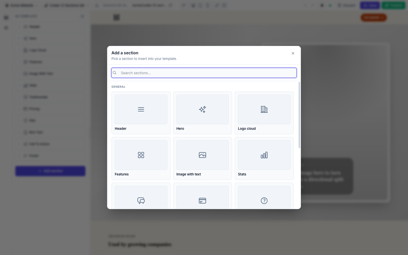
| # | Section | Slug | Icon | Blocks |
|---|---|---|---|---|
| 1 | Header | header | heroicon-o-bars-3 | nav-link |
| 2 | Hero | hero | heroicon-o-sparkles | proof (limit 4) |
| 3 | Logo cloud | logo-cloud | heroicon-o-building-office-2 | logo |
| 4 | Features | features | heroicon-o-squares-2x2 | feature |
| 5 | Image with text | image-text | heroicon-o-photo | — |
| 6 | Stats | stats | heroicon-o-chart-bar | stat |
| 7 | Testimonials | testimonials | heroicon-o-chat-bubble-left-right | quote |
| 8 | Pricing | pricing | heroicon-o-credit-card | plan |
| 9 | FAQ | faq | heroicon-o-question-mark-circle | item |
| 10 | Rich text | rich-text | heroicon-o-document-text | — |
| 11 | Call to action | cta | heroicon-o-megaphone | — |
| 12 | Footer | footer | heroicon-o-bars-3-bottom-left | link |
| 13 | Newsletter | newsletter | heroicon-o-envelope | — |
| 14 | Contact form | contact | heroicon-o-chat-bubble-left-right | — |
| 15 | Team | team | heroicon-o-user-group | member |
| 16 | Gallery | gallery | heroicon-o-photo | image |
| 17 | Timeline | timeline | heroicon-o-clock | step |
| 18 | Video | video | heroicon-o-play-circle | — |
| 19 | Articles | articles | heroicon-o-newspaper | article |
| 20 | Portfolio | portfolio | heroicon-o-rectangle-group | project |
| 21 | Tabs | tabs | heroicon-o-rectangle-stack | tab (limit 6) |
| 22 | Comparison | comparison | heroicon-o-scale | row |
| 23 | Countdown | countdown | heroicon-o-clock | — |
| 24 | Locations | locations | heroicon-o-map-pin | location |
| 25 | Announcement Bar | banner | heroicon-o-megaphone | — |
| 26 | Marquee | marquee | heroicon-o-arrows-right-left | item |
| 27 | Steps | steps | heroicon-o-list-bullet | step |
| 28 | Bento grid | bento | heroicon-o-rectangle-group | tile |
| 29 | Showcase | showcase | heroicon-o-view-columns | row |
| 30 | Scroll showcase | scroll-showcase | heroicon-o-device-tablet | — |
| 31 | Sticky reveal | sticky-reveal | heroicon-o-queue-list | item |
Interactive sections store submissions
On submit, Newsletter dispatches FilamentCraft\Events\NewsletterSubscribed and Contact form dispatches FilamentCraft\Events\ContactFormSubmitted. The package stores both in the panel's Inbox, can mail each one to you, and guards the forms with a honeypot and a rate limit. Add a listener of your own to forward to a CRM. See Form Submissions.
Where to find them
The full registration list ships in the plugin class; each section class is in src/Sections/Builtin/. To hide or replace them, see Curating the Catalog. The same list also registers a seven-section e-commerce pack (Store hero, Category grid, Product carousel, Product listing, Product page, Cart, Checkout) whose content is driven by live product data through the Storefront contract rather than authored settings (and, when a host registers several, a per-section catalog pick) — see the E-commerce Store example; those aren't covered on this page.
Five sections share one carousel
Gallery, Team, Testimonials, Logo cloud, and the commerce pack's Product carousel all ride the same accessible carousel primitive (arrow buttons, optional dot pagination, RTL-aware scrolling, reduced-motion support). Custom sections can reuse it as the <x-filamentcraft::carousel> Blade component.
Every section below ships the same four preset families — Modern, Editorial, Bold, and Elegant — so the per-section entries list only settings and blocks. See Presets at the end of this page.
Shared style enums
Most sections expose the same four EnumButtons controls, backed by these enums (each implements HasLabel, HasColor, HasIcon and offers an ::options() helper):
| Enum | Setting | Cases |
|---|---|---|
SectionShape | shape | clean, contained, layered, wireframe |
SectionDensity | density | compact, comfortable, airy |
SectionAlignment | align / content_align | start, center |
MediaPlacement | media_mode / media_placement | none, background, start, end |
Every section also exposes a ColorScheme::make('scheme') control — see Color Inputs.
1. Header
A site header with brand, navigation links, an optional CTA, and a locale switcher.
Settings: brand_text (Text), brand_logo (Image), cta_enabled (Toggle), cta_label (Text, shown when cta_enabled), cta_url (Link, shown when cta_enabled), show_locale_switcher (Toggle), show_scheme_toggle (Toggle) + scheme_toggle_placement (Select: inline / floating) — the visitor dark-mode toggle, alignment (Select: split / centered / compact), sticky (Toggle), show_border (Toggle), shape + density (EnumButtons), scheme (ColorScheme), plus the phone bottom bar settings below.
Blocks: nav-link — label (Text), url (Link), placement (EnumButtons: everywhere / header / bottom_bar), icon (Icon).
Phone bottom bar
Switch on show_mobile_nav and phones (below 768px) get a tab bar pinned to the bottom of the screen, built from the header's own nav links. The desktop header doesn't change.
| Setting | Type | Default | What it does |
|---|---|---|---|
show_mobile_nav | Toggle | false | Turns the bar on. |
mobile_nav_style | EnumButtons | docked | docked spans the screen edge; floating is an inset pill. |
mobile_nav_labels | EnumButtons | always | always, active (only the current tab is labelled), or hidden (icons only; labels stay for screen readers). |
mobile_nav_hide_on_scroll | Checkbox | true | Slides the bar away while scrolling down and brings it back on the way up, at the top, and at the end of the page. |
mobile_nav_menu | Checkbox | true | Adds a More tab that opens a bottom sheet. |
mobile_nav_cta | Checkbox | false | Adds the header's call to action as a highlighted tab. |
mobile_nav_cta_icon | Icon | guessed | Icon for that tab. |
How the bar fills its slots:
- It holds up to five tabs, the limit Material and Apple's guidelines both set.
- A link's
placementdecides where it shows.everywherelinks go in the header and the bar.headerlinks stay out of the bar but are still reachable from the More sheet.bottom_barlinks appear only in the bar. Use that for a Home tab, since the brand logo already links home on desktop. - Links that don't fit, header-only links, the call to action (when it isn't a tab), and the language picker all go in the More sheet. Turn
mobile_nav_menuoff and extra links are dropped from the bar instead. The hamburger menu stays available for them. - With the bar on, the header hides its hamburger button on phones, but only when the bar reaches every link, the call to action, and the languages.
- A link without an
icongets one guessed from its label and URL (/contactgets a chat bubble, "Visit" gets a map pin, and so on). Pick one in the icon picker to override it.
The active tab is marked in the browser, not on the server, because the header is cached per locale rather than per page. The longest matching path wins, so /shop/shoes lights up a /shop tab. A #section link lights up while that section is on screen. The More tab lights up when the active link is inside its sheet.
The More sheet is a native popover, so it opens and closes, closes on Esc or a tap outside, and sits above everything without JavaScript. The site script adds drag-down to dismiss and moves focus into the sheet. While a visitor types into a field, the bar hides so it can't cover the field.
Other pinned elements stay clear of the bar through the --fc-bottom-chrome custom property: the back-to-top and WhatsApp buttons, the floating dark-mode toggle, toasts, and the watermark. Read it in your own fixed-position elements:
css
.my-chat-bubble {
    position: fixed;
    inset-block-end: calc(1rem + var(--fc-bottom-chrome, 0px) + env(safe-area-inset-bottom, 0px));
}
Conditionally cached
The header's fragment cache is per locale, but host-provided locale URLs (localeUrlsUsing) can vary per path — so HeaderSection::cacheable() returns false whenever a custom locale URL resolver is registered, and the header renders fresh on every request.
2. Hero
The most-configured section, and a live demonstration of the dual-input schema (DSL settings sit next to raw Filament components like Toggle, ColorPicker, and TemplateUrlPicker).
Settings: eyebrow, heading (Text), subheading (Textarea), cta_enabled (Toggle), cta_url (TemplateUrlPicker — searches published templates), cta_label (Text), cta_secondary_url (TemplateUrlPicker) + cta_secondary_label (Text) — an outlined second button, shown only when both are set, supporting_text (Text), bg_image (Image), media_mode (EnumButtons → MediaPlacement), layout (Select: spotlight / editorial / compact), content_align (EnumButtons → SectionAlignment), density (EnumButtons → SectionDensity), shape (EnumButtons → SectionShape), scheme (ColorScheme), surface_style (Select: glass / solid / none), use_accent_override (Toggle), accent_color (ColorPicker, shown when override is on). Effects (collapsed group, see Effects): backdrop (Select: none / aurora / spotlight / spotlights / beams / meteors / grid / dots / lamp / stars), heading_effect (EnumButtons: none / generate / highlight), heading_highlight (Text, shown for highlight), rotating_words (Textarea, one word or phrase per line, up to six), cta_style (EnumButtons: default / moving-border / glow-border).
Blocks: proof (limit 4) — value (Text), label (Text).
3. Logo cloud
Social-proof logos in a grid or single row.
Settings: eyebrow, title (Text), intro (Textarea), layout (Select: grid / row / marquee / carousel), align (EnumButtons → SectionAlignment), shape + density (EnumButtons), tone (Select: mono / color), scheme (ColorScheme).
Blocks: logo — name (Text), logo (Image).
4. Features
A feature grid with configurable layout, column count, and per-card icon/proof.
Settings: eyebrow, title (Text), intro (Textarea), layout (Select: cards / bands / minimal), columns (Select: 2 / 3 / 4), align (EnumButtons → SectionAlignment), shape + density (EnumButtons), effect (Select: none / glow — a spinning gradient border on hover and focus — / highlight — a tinted ring that lingers as the pointer moves on), scheme (ColorScheme).
Blocks: feature — icon (Icon), eyebrow (Text), title (Text), description (Textarea), stat (Text), url (Link).
5. Image with text
One idea, a supporting image, and focused copy. No blocks.
Settings: eyebrow, title (Text), body (Textarea), url (Link), label (Text), image (Image), media_placement (EnumButtons → MediaPlacement), align (EnumButtons → SectionAlignment), shape + density (EnumButtons), scheme (ColorScheme).
6. Stats
Concise metrics in a grid or band.
Settings: eyebrow, title (Text), intro (Textarea), layout (Select: grid / band), align (EnumButtons → SectionAlignment), shape + density (EnumButtons), scheme (ColorScheme).
Blocks: stat — icon (Icon), value (Text), label (Text), description (Textarea).
7. Testimonials
Customer quotes as cards, a featured quote, or a compact list.
Settings: eyebrow, title (Text), intro (Textarea), layout (Select: cards / featured / compact / carousel / moving), rows (Select: 1 / 2, shown for moving — the second row runs the other way), speed (Select: slow / normal / fast, shown for moving), align (EnumButtons → SectionAlignment), shape + density (EnumButtons), scheme (ColorScheme).
Blocks: quote — quote (Textarea), name (Text), role (Text), avatar (Image).
8. Pricing
Comparable pricing plans with a highlightable tier.
Settings: eyebrow, title (Text), intro (Textarea), billing_note (Text), align (EnumButtons → SectionAlignment), shape + density (EnumButtons), scheme (ColorScheme).
Blocks: plan — name (Text), price (Text), period (Text), description (Textarea), features (Textarea, one per line), highlighted (Toggle), url (Link), label (Text).
9. FAQ
Accessible disclosure list — no JavaScript required.
Settings: eyebrow, title (Text), intro (Textarea), align (EnumButtons → SectionAlignment), shape + density (EnumButtons), scheme (ColorScheme).
Blocks: item — question (Text), answer (Textarea).
10. Rich text
Long-form content with an article or split-with-aside layout. No blocks.
Settings: eyebrow, title (Text), body (RichText), aside_title (Text), aside_body (RichText), layout (Select: article / split), width (Select: sm / md / lg), align (EnumButtons → SectionAlignment), shape + density (EnumButtons), scheme (ColorScheme), surface (Toggle — wrap content in a surface).
11. CTA
A conversion moment as a centered card, split callout, or inline banner. No blocks.
Settings: badge (Text), heading (Text), subheading (Textarea), note (Text), url (Link), label (Text), layout (Select: center / split / banner), align (EnumButtons → SectionAlignment), shape + density (EnumButtons), scheme (ColorScheme), backdrop (Select, the same set as the Hero) and cta_style (EnumButtons: default / moving-border / glow-border) — see Effects.
12. Footer
A branded footer with a description, copyright, and grouped links.
Settings: brand (Text), description (Textarea), copyright (Textarea), show_scheme_toggle (Toggle) + scheme_toggle_placement (Select: inline / floating) — the visitor dark-mode toggle, density (EnumButtons → SectionDensity), shape (EnumButtons → SectionShape), scheme (ColorScheme).
Blocks: link — column (Text, optional grouping heading), label (Text), description (Textarea), url (Link).
13. Newsletter
An interactive email-capture form (LivewireSection). On submit it dispatches FilamentCraft\Events\NewsletterSubscribed. No blocks.
Settings: heading (Text), subheading (Textarea), placeholder (Text), button_label (Text), success_message (Text), density (EnumButtons → SectionDensity), scheme (ColorScheme).
14. Contact form
An interactive name/email/message form (LivewireSection). On submit it dispatches FilamentCraft\Events\ContactFormSubmitted. No blocks.
Settings: heading (Text), subheading (Textarea), name_label / email_label / message_label / button_label (Text), success_message (Text), density (EnumButtons → SectionDensity), scheme (ColorScheme).
15. Team
Team members as profile cards, large portraits, or a minimal list — in a grid or a carousel.
Settings: eyebrow, title (Text), intro (Textarea), layout (Select: grid / carousel), style (Select: cards / portraits / minimal), columns (Select: 2 / 3 / 4), align (EnumButtons → SectionAlignment), show_socials (Checkbox), shape + density (EnumButtons), effect (Select: none / focus — pointing at one member blurs the rest), scheme (ColorScheme).
Blocks: member — photo (Image), name (Text), role (Text), bio (Textarea), x_url (Text), linkedin_url (Text), github_url (Text).
16. Gallery
An image gallery as a grid, a masonry wall, or a carousel, with configurable captions.
Settings: eyebrow, title (Text), intro (Textarea), layout (Select: grid / masonry / carousel), columns (Select: 2 / 3 / 4), ratio (Select: square / landscape / portrait / adapt), captions (Select: none / below / overlay), align (EnumButtons → SectionAlignment), shape + density (EnumButtons), effect (Select: none / focus — pointing at one image blurs the rest and slides its caption up; grid and masonry only), scheme (ColorScheme).
Blocks: image — image (Image), caption (Text), url (Text).
Masonry ignores the aspect ratio
The masonry layout uses each image's natural height, so the ratio setting only applies to the grid and carousel layouts.
17. Timeline
Ordered steps as a horizontal stepper, a vertical timeline, or alternating sides — for how-it-works flows, processes, roadmaps, and company histories.
Settings: eyebrow, title (Text), intro (Textarea), style (Select: steps / vertical / alternating / beam — a gradient beam fills the rail as the section scrolls, with a sticky date column on desktop), marker (Select: number / icon / dot), align (EnumButtons → SectionAlignment), shape + density (EnumButtons), scheme (ColorScheme).
Blocks: step — icon (Icon), meta (Text, a date or label), title (Text), description (Textarea).
18. Video
An embedded video with a heading and optional cover image. No blocks.
Settings: eyebrow, heading (Text), description (Textarea), video_url (Text), cover (Image, optional cover shown before playback), width (Select: contained / narrow / full), ratio (Select: wide 16:9 / standard 4:3 / cinema 21:9), align (EnumButtons → SectionAlignment), shape + density (EnumButtons), scheme (ColorScheme).
Privacy-friendly embeds
VideoSection::parseVideo() accepts YouTube URLs (watch, embed, shorts, and youtu.be forms), Vimeo URLs, and direct .mp4 / .webm / .ogg file URLs. YouTube embeds go through youtube-nocookie.com; direct files render as a native <video> element with the cover as its poster. When a cover image is set, the iframe renders a lightweight srcdoc facade — the cover plus a play button — so the third-party player only loads after the visitor clicks play. Unrecognised URLs render nothing on the live site (the editor shows a placeholder instead).
19. Articles
Blog posts or changelog entries as a card grid or a featured-plus-list layout, with an optional view-all link.
Settings: eyebrow, title (Text), intro (Textarea), view_all_label (Text), view_all_url (Link), layout (Select: grid / featured), columns (Select: 2 / 3), show_meta (Checkbox), show_tags (Checkbox), align (EnumButtons → SectionAlignment), shape + density (EnumButtons), scheme (ColorScheme).
Blocks: article — image (Image), tag (Text), title (Text), excerpt (Textarea), meta (Text, e.g. Jun 12, 2026 · 6 min read), url (Link).
20. Portfolio
Projects or case studies with categories and result metrics, in a grid or with the first project featured.
Settings: eyebrow, title (Text), intro (Textarea), layout (Select: grid / featured), columns (Select: 2 / 3), show_categories (Checkbox), show_results (Checkbox), align (EnumButtons → SectionAlignment), shape + density (EnumButtons), scheme (ColorScheme).
Blocks: project — image (Image), category (Text), title (Text), summary (Textarea), result (Text, e.g. +240% signups), url (Link).
21. Tabs
Tabbed content panels — one tab per audience, discipline, or use case.
Settings: eyebrow, title (Text), intro (Textarea), tab_style (Select: underline / pills / boxed), placement (Select: top / start — tabs on top or at the side), align (EnumButtons → SectionAlignment), shape + density (EnumButtons), scheme (ColorScheme).
Blocks: tab (limit 6) — label (Text), icon (Icon), heading (Text), body (Textarea), image (Image).
Accessible tablist, graceful fallback
The markup follows the APG tabs pattern — role="tablist" / tab / tabpanel, aria-selected, roving tabindex, and Arrow / Home / End keyboard navigation (arrow keys flip in RTL). Panels are only hidden once the site JS initialises, so without JavaScript every panel renders stacked and the content stays readable.
22. Comparison
A feature-comparison table — your column against one or two competitors, with an optional CTA.
Settings: eyebrow, title (Text), intro (Textarea), our_label (Text), competitor_a_label (Text), competitor_b_label (Text, leave empty for a two-column table), highlight_ours (Checkbox), cta_label (Text), cta_url (Link), align (EnumButtons → SectionAlignment), shape + density (EnumButtons), scheme (ColorScheme).
Blocks: row — feature (Text), us (Text), competitor_a (Text), competitor_b (Text).
Cell values: yes, no, or free text
Each cell accepts yes (renders a check mark) or no (renders a muted cross with a screen-reader label) — matched case-insensitively, so Yes and NO work too — or any free text (Limited, Paid add-on, 10 minutes) rendered as-is.
23. Countdown
A live-ticking countdown to a launch, event, or deadline, with an expired state. No blocks.
Settings: eyebrow, heading (Text), subheading (Textarea), cta_label (Text), cta_url (Link), target_date (raw Filament DateTimePicker), expired_message (Text), show_labels (Checkbox), align (EnumButtons → SectionAlignment), shape + density (EnumButtons), scheme (ColorScheme).
Never cached, always current
Countdown overrides cacheable(): false, so its HTML is excluded from the page cache — the server-rendered digits are correct on every request, and the site JS ticks them every second from there. Once the target passes (server- or client-side), the tile grid is swapped for the expired_message. The tiles are aria-hidden; a visually hidden sentence announces the target date to screen readers instead.
24. Locations
Offices or stores as a live map plus contact cards. Give a location a latitude and longitude and the section draws a real slippy map around it — pannable, zoomable, numbered pins tied to the cards, no API key and no account anywhere.
Settings: eyebrow, title (Text), intro (Textarea), map_source (Select: auto / map / embed / image / none), map_zoom (Select: auto fit-all, or world → building), map_ratio (Select: wide / standard / square / tall), map_tone (Select: natural / muted / tinted / night), map_interactive (Checkbox), map_embed_url (Text), map_image (Image), layout (Select: split map + cards / cards only), columns (Select: 2 / 3), align (EnumButtons → SectionAlignment), shape + density (EnumButtons), scheme (ColorScheme).
Blocks: location — name (Text), address (Textarea), lat + lng (Text), phone (Text), email (Text), hours (Text), map_url (Link, directions link).
Coordinates
Editors rarely type coordinates. Paste anything a map hands you into either field and the section finds the pair:
48.8584, 2.2945https://www.google.com/maps/place/…/@48.8584,2.2945,17z- a Google "share" link carrying
!3d48.8584!4d2.2945 https://www.openstreetmap.org/#map=17/48.8584/2.2945https://www.openstreetmap.org/?mlat=48.8584&mlon=2.2945geo:48.8584,2.2945
A location with coordinates and no map_url gets a Get directions link built from them.
How map_source resolves
auto (the default) walks a fallback chain, so an existing site that only has an embed URL keeps rendering exactly what it rendered before:
- any location with coordinates → the tile map
- else
map_embed_url→ the iframe - else
map_image→ the static image - else nothing (a placeholder in the editor)
Pick map, embed, image, or none to force one and skip the chain.
The map itself
The server resolves the zoom that frames every pin, the tiles that cover the canvas, and where each pin lands — then emits them as percentages, so the finished map is correct before any JavaScript runs and never shifts layout. The site bundle then re-tiles at the element's real pixel width and adds drag-to-pan, zoom buttons, Ctrl/⌘ + scroll, and double-click zoom. Clicking a card's pin number centres the map on that location. Plain scrolling always scrolls the page — the map never traps it.
map_tone re-skins the raster without touching the provider: muted desaturates it, tinted duotones it into the scheme's primary and accent, night inverts it for dark schemes.
The default tile provider is fine to start with, not to scale on
Tiles come from tile.openstreetmap.org, whose usage policy serves them best-effort with no SLA and warns that commercial access "may be withdrawn at any point". That is the right trade for getting a map with zero setup — it is not the right trade for a busy storefront. Point filamentcraft.maps.tile_url at your own provider before you need to:
php
'maps' => [
    'tile_url' => 'https://tiles.stadiamaps.com/tiles/alidade_smooth/{z}/{x}/{y}{r}.png',
    'attribution' => '© Stadia Maps © OpenMapTiles © OpenStreetMap',
    'attribution_url' => 'https://www.openstreetmap.org/copyright',
    'max_zoom' => 20,
],
The template understands {z}, {x}, {y}, {s} (subdomain) and {r} (retina). Stadia, MapTiler, and Thunderforest all serve @2x tiles, which OpenStreetMap does not. Self-hosting Protomaps removes the dependency entirely.
Attribution is not decoration — most providers, OpenStreetMap included, require it. It renders in the corner of every map and is driven by the two config keys above. Set tile_url to an empty string to turn tile maps off site-wide; coordinates then fall back to OpenStreetMap's own embed, which stays interactive but shows only one marker.
Map embeds are allowlisted
map_embed_url only renders if it starts with one of three prefixes — https://www.google.com/maps/embed, https://maps.google.com/maps, or https://www.openstreetmap.org/export/embed. Anything else is silently dropped and the static map_image (if any) is shown instead.
25. Announcement Bar
A slim site-wide announcement — a full-width bar or a floating pill — with an optional link and dismiss button. No blocks.
Settings: icon (Icon, optional emoji or heroicon name), text (Text), cta_label (Text), cta_url (Link), style (Select: bar / floating), tone (Select: brand / surface), dismissible (Checkbox), scheme (ColorScheme).
Dismissal persists per section
When a visitor dismisses the banner, the site JS stores fc-banner-dismissed-{section id} in localStorage and hides it on every future visit (editing the text won't bring it back — removing and re-adding the section will, since the id changes). In the editor's design mode the storage key is omitted, so the banner never disappears while you're editing; if localStorage is unavailable the banner simply stays visible.
26. Marquee
An endlessly scrolling ticker of logos or words, built on the same pure-CSS marquee as the logo cloud: no JavaScript, it pauses on hover and focus, runs the right way in right-to-left languages, and becomes a static wrapped row under prefers-reduced-motion.
Settings: title (Text, the caption), style (Select: plain / pills), speed (Select: slow / normal / fast), direction (Select: forward / reverse), grayscale (Select: muted — logos colour in on hover — / full), scheme (ColorScheme).
Blocks: item — text (Text), image (Image, optional logo), url (Link, optional).
27. Steps
A numbered "how it works" sequence, in a row of columns or a vertical stack.
Settings: eyebrow, title (Text), intro (Textarea), layout (Select: row / stack), columns (Select: 2 / 3 / 4), align (EnumButtons → SectionAlignment), shape + density (EnumButtons), scheme (ColorScheme).
Blocks: step — icon (Icon, optional), title (Text), description (Textarea).
28. Bento grid
An asymmetric grid of feature tiles in mixed sizes.
Settings: eyebrow, title (Text), intro (Textarea), align + density (EnumButtons), scheme (ColorScheme).
Blocks: tile — size (Select: small / wide / tall / large), tone (Select: surface / accent / image), icon (Icon), title (Text), description (Textarea), image (Image, used by the image tone), url (Link, optional).
29. Showcase
Alternating media-and-copy rows for walking through a product one feature at a time.
Settings: eyebrow, title (Text), intro (Textarea), first_media_side (Select: end / start — rows alternate from there), density + shape (EnumButtons), scheme (ColorScheme).
Blocks: row — eyebrow, title (Text), description (Textarea), bullets (Textarea, one per line), image (Image), url (Link, optional "Learn more").
30. Scroll showcase
A product screenshot in a device frame that starts tilted back and settles flat as it scrolls into view, while the heading slides up. With no image uploaded it shows a dashboard mock in your theme colours.
Settings: eyebrow, title (Text), intro (Textarea), image (Image), frame (Select: tablet / browser / plain), tilt (Select: subtle / classic / dramatic), align + density (EnumButtons), scheme (ColorScheme).
31. Sticky reveal
Text blocks scroll past a pinned media panel that follows the block you are reading; the others dim. On narrow screens, or in browsers without scroll-driven animations, it becomes a plain alternating list of text and media.
Settings: eyebrow, title (Text), intro (Textarea), media_side (Select: start / end), align + density (EnumButtons), scheme (ColorScheme).
Blocks: item — title (Text), description (Textarea), image (Image; without one the panel shows a theme-gradient card with the block title).
Presets
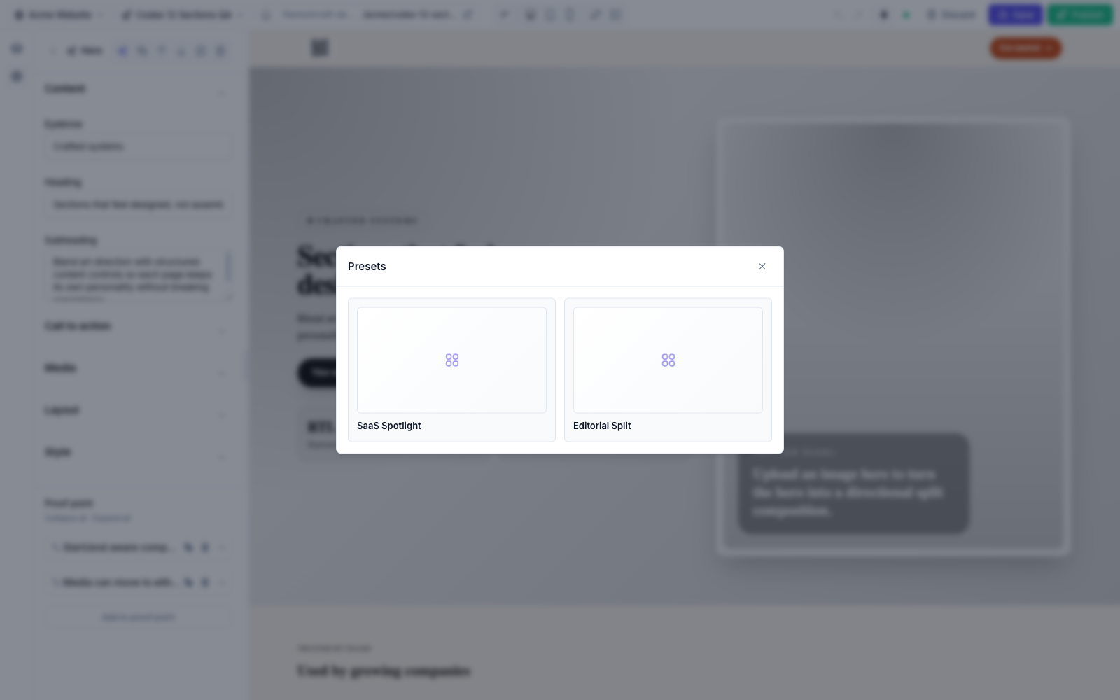
A preset is a named starting point — a bundle of settings and blocks the editor can apply in one click. Every built-in section ships the same four style families — Modern (SaaS), Editorial (studio), Bold (startup), and Elegant (premium) — each with its own color scheme, rhythm, and copy. Because the four share slugs across every section, they also drive the starter-site seeder: pick a family once and a whole cohesive site is generated. Define your own on a custom section by returning Preset objects from a static presets() method.
Blocks
A block is a repeatable child item within a section (a nav link, a pricing plan, a quote). Blocks have their own settings schema and an optional limit. See Custom Sections for how to declare them.