
Appearance
Layout & Structure
Spacing stores a layout value (four-sided padding/margin), while Group and Category add structure to a settings panel rather than storing a value — they organise the other inputs into readable, collapsible sections.
Spacing
A four-sided spacing control — top, right, bottom, left — with a link toggle that syncs every side at once. Compiled to FilamentCraft's SpacingField and rendered as a cross of numeric inputs around a central lock button, it's the right control for section padding or margin.
Spacing control — four per-side inputs around a central link toggle that syncs all sides.php
use FilamentCraft\Settings\Types\Spacing;

Spacing::make('padding')
    ->label('Custom padding')
    ->min(0)->max(200)
    ->step(2)
    ->unit('px')
->default(['top' => 32, 'right' => 0, 'bottom' => 32, 'left' => 0]);| Method | Effect |
|---|---|
min(int|float $min) | Minimum value per side (default 0). |
max(int|float $max) | Maximum value per side (default 200). |
step(int|float $step) | Stepper increment (default 1). |
unit(string $unit) | CSS unit appended to each side (default px). |
sides(array $sides) | Restrict the editable sides, e.g. ->sides(['top', 'bottom']) for a vertical-only control. |
The stored value is {top, right, bottom, left, linked}; a bare number (or ->default(16)) is accepted as a uniform shorthand. In a section's Blade view, read it through the value object's css() helper, which collapses to the shortest valid CSS shorthand (1 / 2 / 4 values):
blade
@php($pad = $section->settings->get('padding'))
<section @if ($pad) style="padding: {{ $pad->css() }}" @endif>
  …
</section>
$pad is a SpacingValue (or null when unset). Each side is also a raw float property ($pad->top, $pad->right, …) for hand-composed CSS, while the ->top() / ->right() methods return the unit-suffixed string. The object is Stringable, so {{ $pad }} emits the shorthand.
blade
{{-- raw per-side access, à la Bagisto --}}
style="padding: {{ $pad->top }}px {{ $pad->right }}px {{ $pad->bottom }}px {{ $pad->left }}px"
Margins & negative values. The control defaults min to 0, but negative values are fully supported — set a negative min for a margin control (Spacing::make('margin')->min(-80)->max(80)) and the field, value object, and css() output all handle them. The link toggle's state is stored when set and otherwise inferred from the data (all sides equal ⇒ linked), so importing a plain {top, right, bottom, left} map never silently re-syncs asymmetric values.
Group
A sub-heading that visually groups the inputs that follow it, compiled to a Filament section header. Used inside a single section's settings list to break a long form into labelled clusters.
php
use Filament\Forms\Components\Toggle;
use FilamentCraft\Settings\Types\Group;
use FilamentCraft\Settings\Types\Text;
use FilamentCraft\Settings\Types\Textarea;

return [
    Group::make('content_group')->label('Content'),
    Text::make('heading')->label('Heading'),
    Textarea::make('subheading')->label('Subheading'),

    Group::make('cta_group')->label('Call to action')->collapsed(),
    Toggle::make('cta_enabled')->label('Show button'),
    Text::make('cta_label')->label('Button label'),
];| Method | Effect |
|---|---|
content(string $content) | Optional descriptive text under the group heading (falls back to info()). |
collapsed(bool $collapsed = true) | Start the group collapsed. |
icon(string $icon) | An icon for the group heading. |
A Group doesn't nest its fields as children — it acts as a divider/header, and every field listed after it (until the next Group) belongs to it visually. This is the pattern every built-in section uses (content_group, cta_group, layout_group, style_group).
An unlabeled Group renders its raw id as the heading (content_group, verbatim) — always give it a ->label().
Groups only group in section settings
This swallow-the-following-fields behaviour exists only when compiling a section'ssettings(). Inside a Category's settings([...]) each child compiles on its own, so a Group placed there renders as an empty collapsible header and does not absorb the fields after it. Structure theme panels with Category instead.
Category
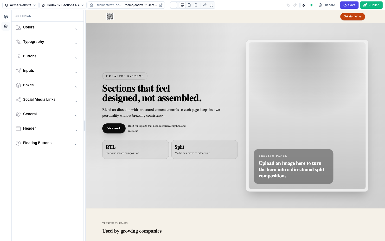
Category in the theme's settingsSchema().A top-level collapsible panel for the theme template-settings panel. Unlike Group, Category contains its settings via settings(), and each category becomes a distinct collapsible block in the editor's theme panel.
php
use FilamentCraft\Settings\Types\Category;
use FilamentCraft\Settings\Types\Font;
use FilamentCraft\Settings\Types\Range;

Category::make('typography')
    ->label('Typography')
    ->icon('heroicon-o-language')
    ->collapsed(false)   // open by default; categories are collapsed otherwise
    ->settings([
        Font::make('default_font')->cssVar('--font-default')->default('inter'),
        Range::make('body_size')->cssVar('--font-body-size', 'px')
            ->unit('px')->min(12)->max(20)->default(16),
]);| Method | Effect |
|---|---|
icon(string $icon) | Icon shown next to the category title. |
collapsed(bool $collapsed = true) | Start collapsed. Categories are collapsed by default — pass ->collapsed(false) to open one. |
settings(array $settings) | The settings contained in this category. |
info() renders as the panel's description text. An unlabeled Category falls back to a headlined version of its id (brand_colors → "Brand Colors").
Category is the backbone of a theme's settingsSchema() — see Theme Authoring for a complete multi-category theme class.
Group vs. Category
Group | Category | |
|---|---|---|
| Where | Inside a section's settings() | Top level of a theme schema |
| Holds children? | No — acts as a divider/header | Yes — via ->settings([...]) |
| Default state | Open | Collapsed |
| Description text | content(), falling back to info() | info() |
| Unlabeled fallback | Raw id | Headlined id |
| Typical use | Cluster a section's fields | A whole theme panel (Colors, Typography, Buttons…) |