
Appearance
No-Code Section Builder
Your users can design their own section types without touching PHP. They compose one from a palette of blocks, save it, and it lands in the Add section catalog next to the built-in sections — same live preview, same settings panel, same published output.
This is the no-code sibling of Custom Sections. That page is for you, the developer, writing a section class. This page is for the people using the editor.
When to reach for which
A section class is right when the section needs real logic — a database query, an API call, a cache strategy. The builder is right when the section is a composition of copy, images, and layout, and you don't want to ship a release every time marketing wants a new arrangement.
Turning it on
The builder is enabled by default. Publish the migrations and you're done:
bash
php artisan vendor:publish --tag=filamentcraft-migrations
php artisan migrate
Definitions live in filamentcraft_section_definitions, scoped per site — one tenant never sees another's sections.
php
// config/filamentcraft.php
'section_definitions' => [
    'enabled' => env('FILAMENTCRAFT_SECTION_DEFINITIONS', true),

    // Saved definitions allowed per site. Abandoned drafts are swept and never
    // counted, so a closed browser tab cannot use up an operator's allowance.
    'max_per_site' => 50,

    // Blocks allowed in one section's tree. Inserts past this are refused with a
    // notice rather than silently dropped at render time.
    'max_nodes' => 100,

    // Unlocks raw <script> output on the html block. A host-developer decision —
    // never expose this to tenants you don't trust.
    'allow_custom_code' => false,
],
Creating a section
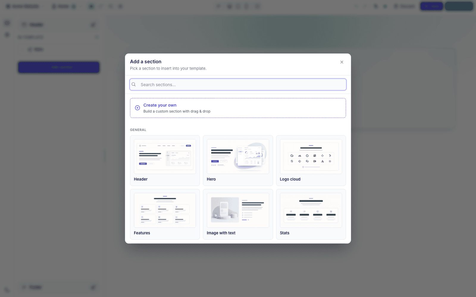
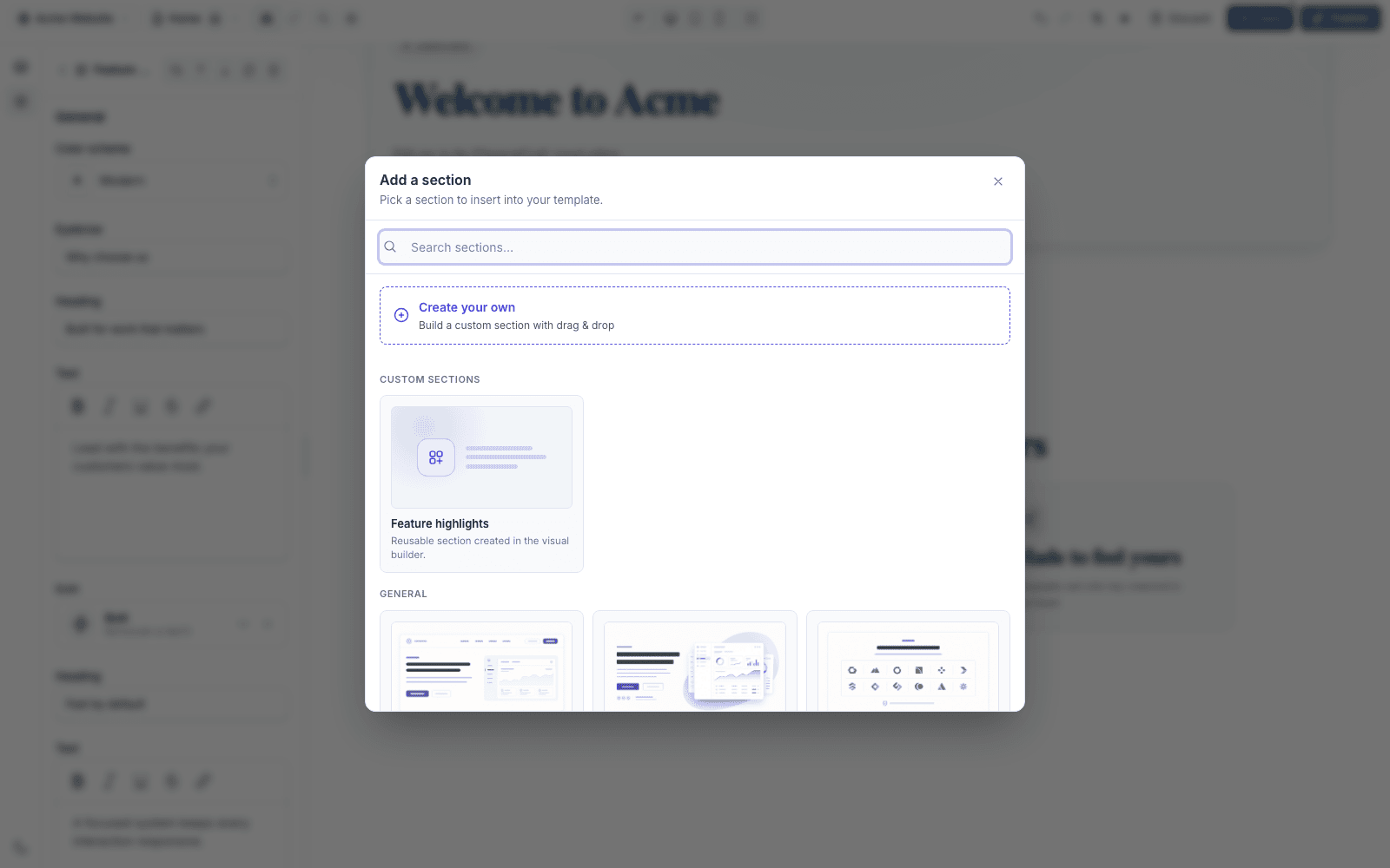
Add section opens the catalog with a Create your own card above the built-ins.
Start from a layout
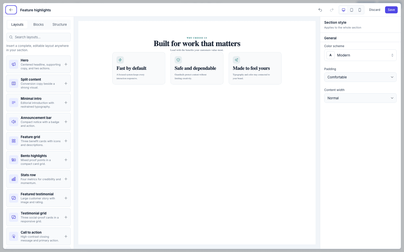
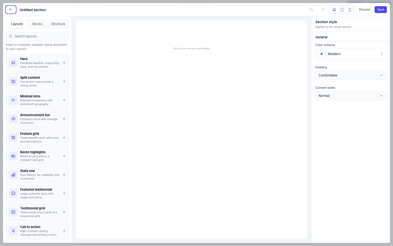
Building from an empty canvas is slow, so the Layouts tab ships 24 complete arrangements — hero, split content, feature grid, pricing, FAQ, team, timeline, testimonial, and more. Each inserts as ordinary blocks you can then rearrange or delete. Nothing is locked.
Or assemble from blocks
The Blocks tab holds 25 primitives in six groups:
| Group | Blocks |
|---|---|
| Typography | Heading, Eyebrow, Text, Quote, List |
| Actions | Button, Badge, Accordion, Callout |
| Media | Image, Video, Person, Icon, Logo |
| Data & proof | Statistic, Rating, Price, Progress, Timeline item |
| Layout | Container, Card, Columns, Masonry grid, Spacer, Divider |
| Advanced | HTML |
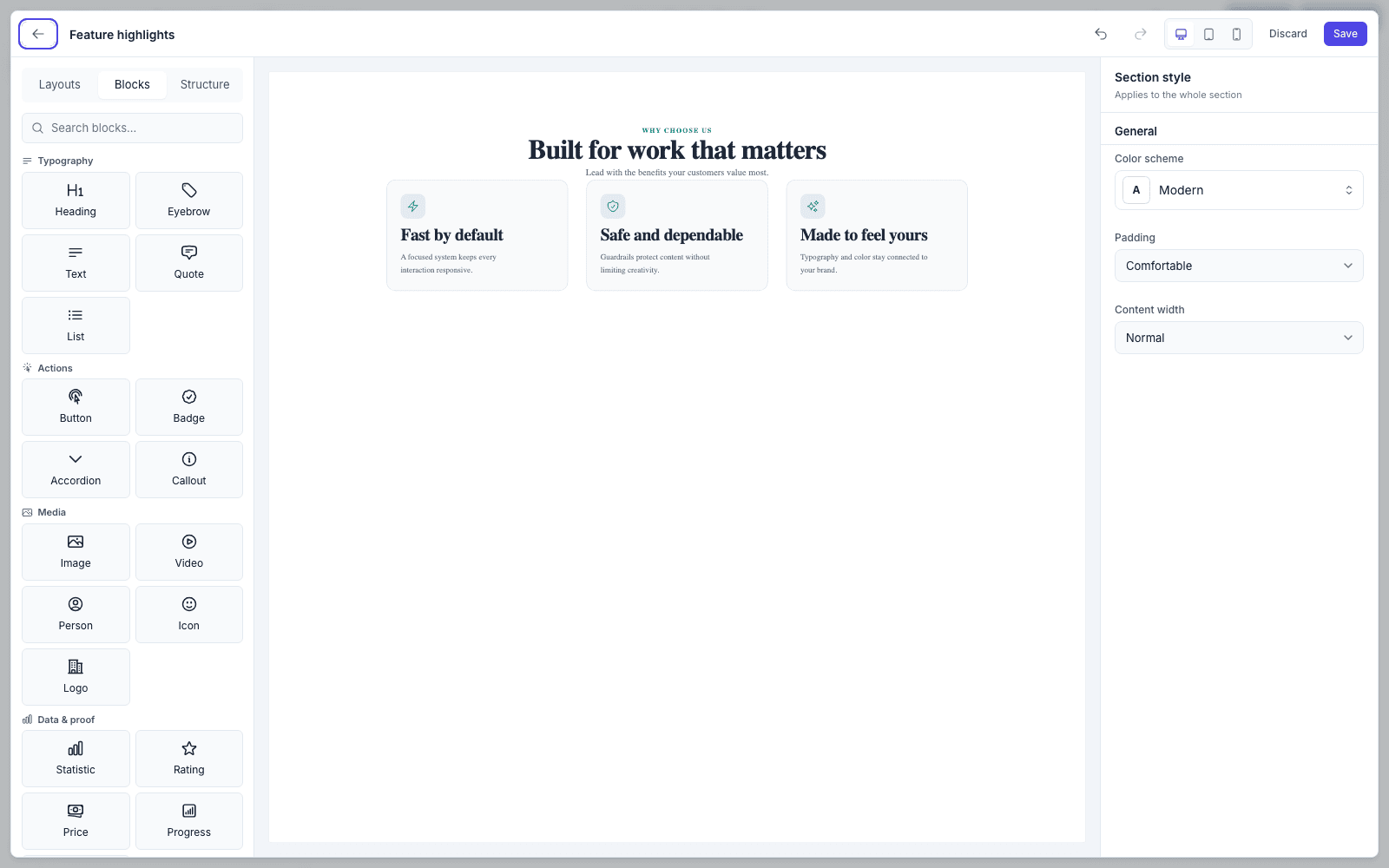
Click a block to append it, or drag it — onto the canvas to drop at a position, or into the structure tree to nest it. Container, Card, Column, and Masonry accept children, so layouts nest up to four levels deep.
Read the tree, not the types
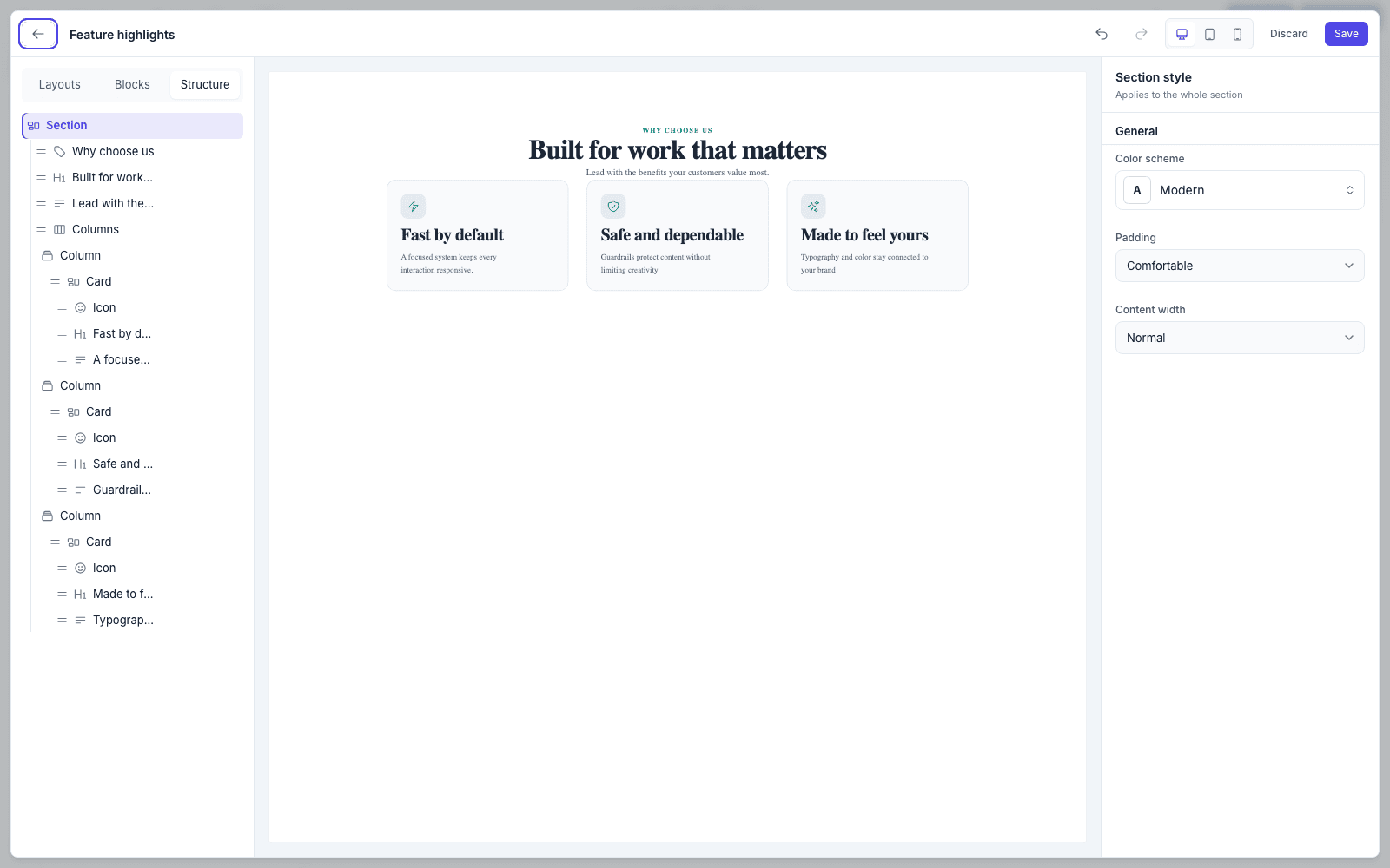
The Structure tab lists every block by its own content, so a section with eight text blocks is still navigable. Drag a row to reorder or reparent; each row also carries move, duplicate, and remove.
Style what you selected
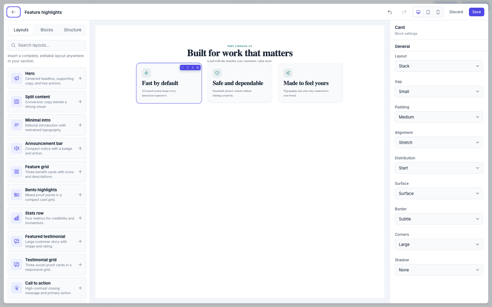
Selecting a block swaps the right rail to its controls — every one live, every one reflected in the canvas on the next round-trip. With nothing selected you get Section style: color scheme, padding, and content width for the whole section.
Work straight on the canvas
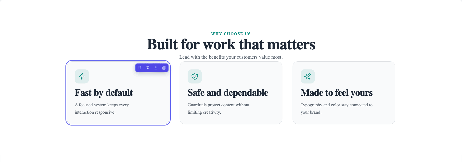
Pointing at a block raises a small toolbar on it — drag to move, add space above or below, or duplicate — so the common edits never require a trip to the structure tree.
Dropping in a layout when the canvas already has content adds a spacer between the two, which is what you'd reach for next anyway.
Blocks stack with a built-in rhythm — a little tighter after an eyebrow, badge or heading — so a layout reads as designed before you touch any spacing. A Spacer replaces that gap rather than adding to it, so the space you set is the space you get.
Check it narrow
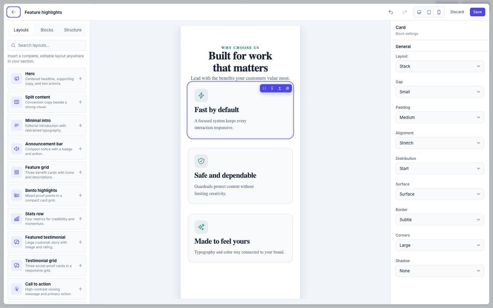
The device switcher renders the canvas at real tablet and mobile widths — the same iframe your visitors get, reflowed. Desktop fills the canvas (never narrower than the 1024px desktop breakpoint), so copy stays readable on a laptop screen instead of shrinking a full-width page. A thin line along the top of the preview shows a change on its way.
Saving
Saving asks for a name and an icon. The name becomes the catalog label and the slug; the icon shows in the catalog and the page's section rail.
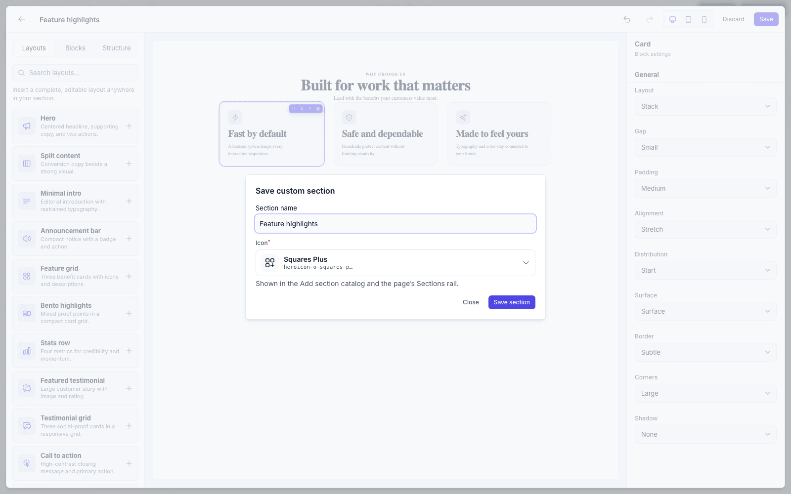
From there, Add to page drops it straight into the page you came from, or Done just files it in the catalog for later.
Re-saving a section updates every page that already uses it. While you edit a saved section, Discard changes throws away only the unsaved edits — the saved version stays in the catalog — and the back arrow closes the builder with your draft kept for next time. If the section was deleted elsewhere while you were building it, Save keeps your layout as a new section.
What your users get back
A saved definition is a real section type. It appears under Custom sections in the catalog, and can be inserted as many times as you like — each instance holding its own content.
The settings panel writes itself
This is the part worth understanding. Every editable prop the user bound while building — each heading's text, each card's copy, each icon — becomes a setting on the section, listed flat in document order and named after the block it edits. Nobody wrote that schema.
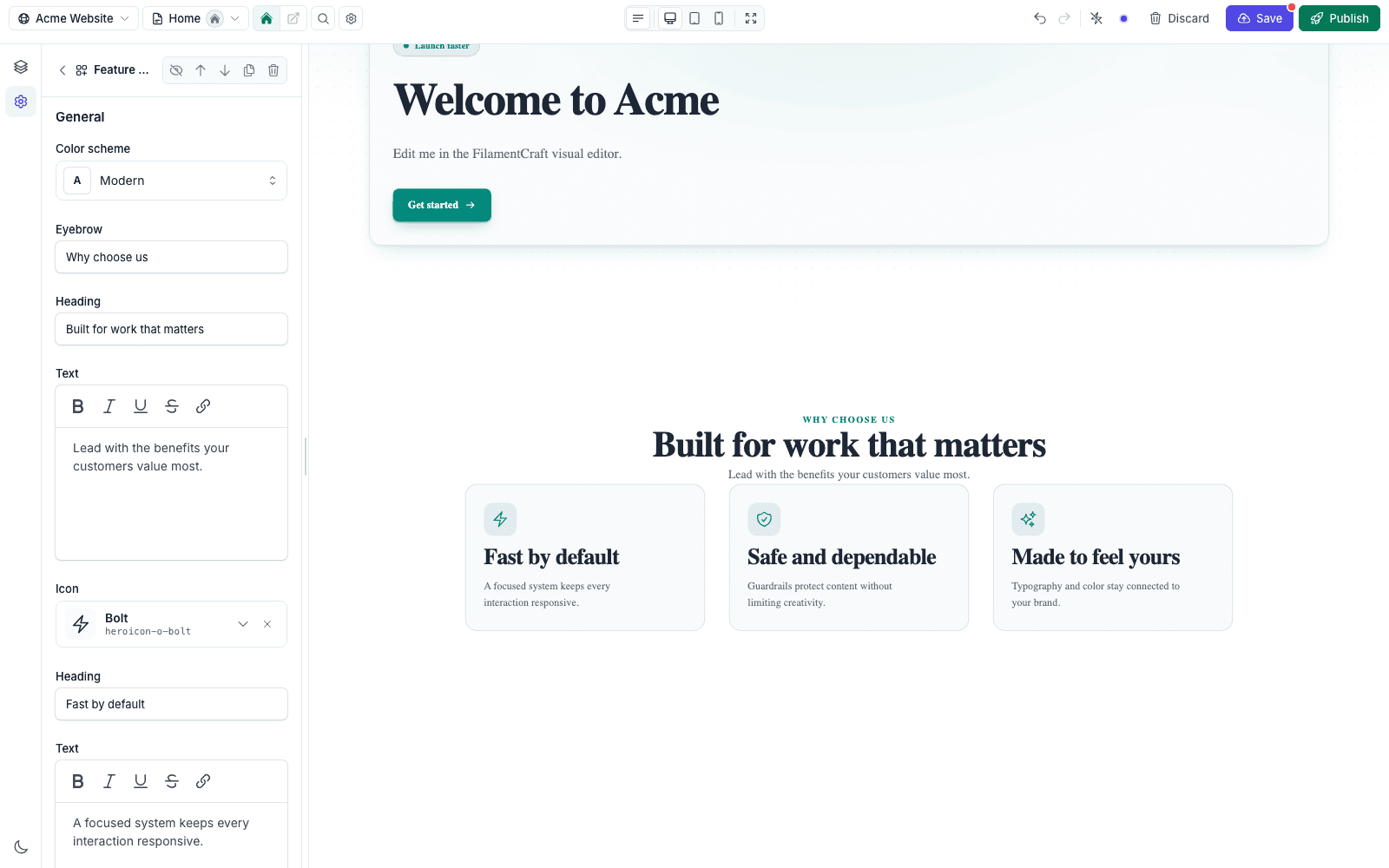
A block with several editable props prefixes each one, so a button reads Button · Label, Button · Link, Button · Icon.
So the person who builds the section and the person who fills it in don't have to be the same person — which is the whole point on a client site.
It publishes like anything else
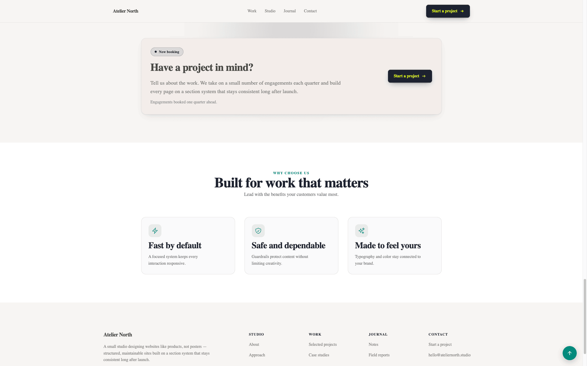
Custom sections are cacheable, respect color schemes and Brand Kit limits, and render per locale like everything else.
How it is stored
Two JSON columns per definition:
layout_json— the element tree the renderer walks. Every node'stypeis checked against an allow-list and every prop resolves through a match-with-default, so stored JSON never reaches markup unvalidated.schema_json— the generated settings, serialised in the same shapeSetting::toArray()produces.
Editing bumps a version counter, which folds into the theme-token hash and therefore into the fragment cache key — so a re-saved section invalidates its own cached HTML without you flushing anything.
Guardrails
The builder is used by people you may not fully trust, so it is deliberately fenced:
- Per-site scoping. Definitions resolve only for their own site. A definition id from another tenant is refused, not just hidden.
- Depth and node caps. Trees stop at four levels and
max_nodesblocks; inserts past either are refused with a notice. - No raw markup by default. The HTML block's markup runs through the shared sanitizer, its CSS is rejected if it could break out of its
<style>, and<script>output requiresallow_custom_code. - Values validated at the boundary. Every control's value is checked against its declared option set or numeric bounds before it reaches the tree.
- Deletion warns first. Deleting a definition that pages already place tells you how many, because those sections will render empty.
php artisan filamentcraft:doctor audits stored definitions and reports broken schemas or sites over the limit.
Styling caveat for host apps
If you inject your own Tailwind build into the storefront via filamentcraft.assets.vite_builds, note that both bundles emit the same utility class names. FilamentCraft's stylesheet declares an explicit cascade-layer order so its own responsive variants survive the collision, while any unlayered CSS of yours still overrides it. Write storefront overrides as plain, unlayered rules and they will win — see Styling & Tailwind.
Limits worth knowing
- A section that has never been saved has no way back once discarded — the builder confirms before throwing that work away.
- Deleting a definition blanks placed instances rather than removing them; clear them from the affected pages afterwards.
- The HTML block is an escape hatch, not a supported extension point. Reach for a section class when you need behaviour.